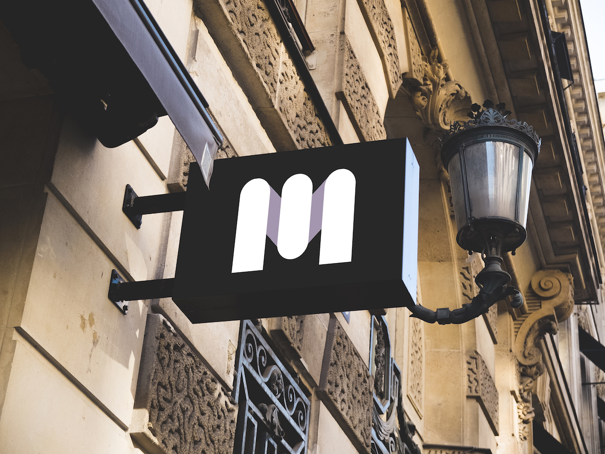
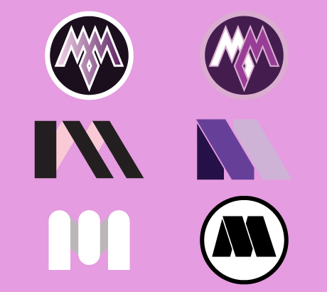
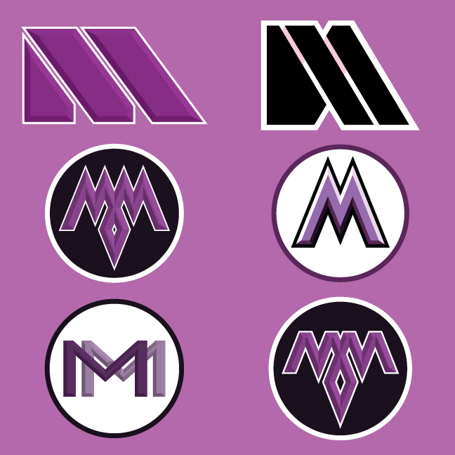
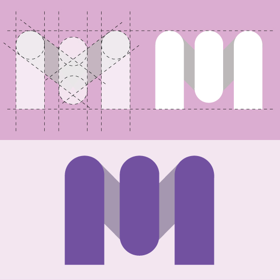
Maia Media is a female-led agency, so the aim was to design a logo that had a more feminine feel. To achieve this, I used rounded corners and thicker ascenders to give the design some volume and weight. The final result was a logo that was feminine yet strong and formidable.
Brand Identity
May, 2017
Maia Media
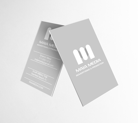
The logo functions to create a strong, clear identity for the media company. It works well on all scales including business cards, signs and billboards. The strength of the logo creates a clear brand recognition.
RJ Gallardo (Designer)